ShopDreamUp AI ArtDreamUp
Deviation Actions


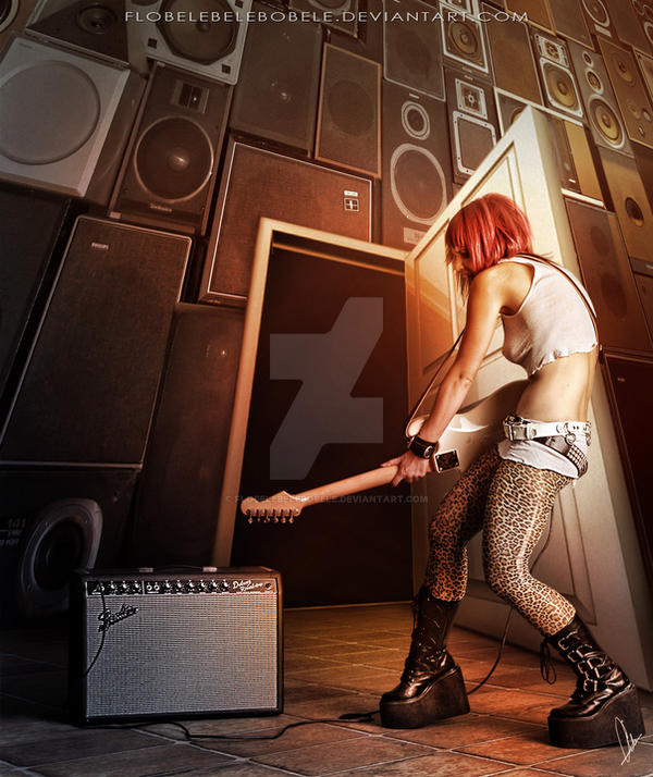
Description
RocknRoll on YouTube [link]
 Credits:
Girl-Oh Yeah - 5 by ~mjranum-stock [link] Marcus Ranum [link]
Model [link]
High resolution: 3D door png by *M10tje [link]
Floor [link]
Wall [link]
---------------------
Tools: Photoshop CS5 & Wacom Bamboo Fun
"Human & Music contest" [link]
 Second Place "Human and Music" Contest [link]
---------------------


IMPORTANT © COPYRIGHT NOTICE
All my works are registered and protected by safecreative.org
© Snezana Skaric Flobelebelebobele. All rights reserved.
My work may not be reproduced, copied, edited, published, transmitted or uploaded in any way without my written permission.
---------------------
Girl-Oh Yeah - 5 by ~mjranum-stock [link] Marcus Ranum [link]
Model [link]
High resolution: 3D door png by *M10tje [link]
Floor [link]
Wall [link]
---------------------
"Human & Music contest" [link]
---------------------
IMPORTANT © COPYRIGHT NOTICE
All my works are registered and protected by safecreative.org
© Snezana Skaric Flobelebelebobele. All rights reserved.
My work may not be reproduced, copied, edited, published, transmitted or uploaded in any way without my written permission.
---------------------
Image size
900x1070px 385.77 KB
© 2012 - 2024 Flobelebelebobele
Comments135
Join the community to add your comment. Already a deviant? Log In
I really love the dynamic pose in this and the angle (from the bottom upward) helps accentuate that nicely. The vanishing point at the top of the image is also a great touch. Perspective wise, everything fits together great!
What has me a bit puzzled is the lighting situation. The girl and the door's shadow on the floor suggest light coming from the right and slightly behind the viewer, but the shadow on the door (that is already there in the render) suggests light coming from the top and behind the door.
Now comes a bit of a personal taste kind of thing, so if you have a different opinion on that, it's all cool. I find the overall lighting to be a bit boring, to be honest. It leaves everything in more or less equal light while the pose & perspective imo call for something just a bit more dramatic, maybe something that leaves her in some kind of spotlight and puts all those speakers on the wall more into shadow (which would also help with the slight flattness that creeps into them on the top right, from doing the perspective transformation - also some more highlights and shadows could help make the forms a bit more 3d).
And lastly, it's a wee bit strange to me (so again, personal taste here) that there is nothing to see beyond the door. With the kind of lighting you chose, we should at least be able to make out some forms beyond the frame. This could also help establish a story for the girl - maybe there's a reason to leave the door open.